A Small Garden Colour Palette for Cloudy Days
A small garden colour palette for cloudy days helps you choose seasonal flowers, foliage, and accents that stay distinct in soft, overcast light.
On a cloudy afternoon, a pale flower can nearly disappear against a gray sky, while a dark leaf still holds its shape. A small garden colour palette for cloudy days starts by noticing those differences, then choosing a few colors that remain easy to read as the season changes.
This is a weeklong planning exercise, not a shopping list to complete in one trip. It uses the garden’s existing colors as a starting point and leaves room for plants that are attractive in more than one season. The aim is a restrained palette with enough contrast to make flowers, foliage, and garden details distinct under soft light.
Day one: Notice which colors stay visible
Choose a cloudy day and spend a few minutes looking at the garden from the places you use most: a kitchen window, a back step, or a chair near the border. Avoid judging color only from a plant label or a bright photograph. Overcast light softens shadows, so nearby colors can seem more alike than they do in direct sun.
Make a short note of what you can distinguish without moving closer. Record plant colors in ordinary terms, such as blue-green, deep purple, chalky pink, or yellow-green. Add nonplant colors too: a terracotta pot, a dark fence, pale gravel, or a painted bench may already provide a strong visual anchor.
Then look for colors that blur together. A white flower against a pale wall may lose its outline. Two neighboring foliage plants with similar gray-green leaves may read as one mass. These observations point to where contrast could help, rather than suggesting that every muted area needs a bright replacement.
Keep the notes concrete. “The dark leaves show from the window; the blush flowers do not” is more useful than “the bed needs more color.”
Day two: Choose a small set of color roles
Give each color a job before selecting particular plants. A compact palette can include a main foliage color, a flower color, a contrasting accent, and a quiet neutral. These are roles, not rigid quantities. One plant may serve more than one role, and the palette can shift as the seasons turn.
- Ground color: A repeated foliage tone, such as green, blue-green, or bronze, links different parts of the planting.
- Flower color: A chosen family of flower shades gives the garden a recognizable seasonal note, such as soft pinks or deep purples.
- Contrast color: A darker, lighter, warmer, or cooler tone helps flowers and leaves separate from their surroundings.
- Quiet neutral: Gray foliage, bark, stone, or a subdued container can give the stronger colors a place to rest.
For cloudy conditions, contrast matters more than adding many hues. A pale yellow bloom beside deep green foliage may remain distinct, while two mid-toned pinks could merge from a distance. The same color can also look different beside a warm brick wall than beside a cool gray fence.
Write down a few candidate colors, then keep the set narrow enough to remember. If you cannot describe the palette simply, remove a color that does not have a clear role.
Day three: Check the palette beside real materials
Place your notes beside the surfaces the plants will actually sit against. Look at the fence, house siding, path, containers, and neighboring foliage. A color that seems lively on a seed packet may become hard to see against a similarly toned wall.
Use scraps of colored paper, paint cards, or fabric to compare broad color families. Hold them near the planting area rather than relying on memory. This is not a substitute for seeing a plant in bloom; it is a way to catch obvious clashes and weak contrasts before choosing plants.
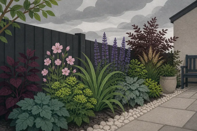
Say you have a narrow border beside a charcoal fence, with pale stones at its edge. You note that small white flowers disappear against the stones, while purple leaves remain visible against the fence. You could keep white as a small highlight, choose a darker flower color for the main seasonal note, and use green foliage to connect the two. The expected result is a border with clearer shapes from the path without adding a long list of colors.
Make a separate note for any surface that changes color through the year. Fresh timber, weathered pots, and seasonal leaf litter can alter the setting around a planting.
Day four: Match color choices to the season
List the months or seasonal moments when you most want the garden to hold interest. Then note which colors are likely to be present at those times. Some plants bring their strongest color in flowers; others contribute through foliage, seed heads, stems, or bark after flowering ends.
Think in overlapping layers. Early foliage may provide the ground color before summer flowers open. Later, seed heads or autumn leaves can keep the palette legible after blooms fade. Evergreen leaves, where they suit the site, can act as a steady visual note while other colors come and go.
Do not assume that a plant’s nursery image predicts its appearance in every setting. Check its mature color descriptions and growing needs, and consider how the foliage looks when flowers are absent. For plant suitability and any product use, follow the plant label, manufacturer instructions, and local rules where relevant.
Write one short seasonal line for each period you care about: “spring: fresh green and violet,” or “late season: bronze foliage and seed heads.” If one period has no color role at all, decide whether that gap matters to how you use the garden.
Day five: Compare color at the viewing distance
Colors that look distinct close up may blend when viewed from a doorway. Return to the spots you noted on the first day and compare the planned palette at those distances. If possible, look at the garden in both bright and overcast conditions, but judge the cloudy view on its own terms.
Notice value as well as hue. Value means how light or dark a color appears. Two plants may both be purple yet differ enough in lightness to remain separate; a pale green and a pale yellow may be different hues but similar in value. In soft light, those value differences can help preserve the outline of each planting group.
Check the arrangement on paper with simple color blocks if the planting is not in place yet. A few rectangles are enough to show whether a dark accent is stranded at one end or whether a pale tone dominates the view. This is a quick way to revise the palette without turning the plan into a detailed drawing.
Day six: Test the palette with the plants you have
Before buying anything, identify which existing plants already fit the color roles. Note their foliage, flowers, and changing seasonal features. A familiar plant may offer more palette value than its brief flowering period suggests.
For each possible addition, ask whether it contributes a distinct color, extends an existing color into another season, or connects two parts of the garden. If the answer is unclear, leave it off the short list for now. A restrained palette is not a ban on variety; it gives each addition a reason to belong.
Check practical growing conditions separately from color. Sun exposure, soil, moisture, and available space all affect which plants can thrive. Choose from plants suited to the actual site, then compare their colors in the role you have assigned rather than selecting by color alone.
Keep a short list of candidates with their expected flower and foliage colors. Leave room for substitutions. If a plant is unavailable or unsuitable, another plant that fills the same role may preserve the palette better than a close match chosen only by its bloom.
Day seven: Write a flexible planting note
Bring the week’s observations together in a brief note you can use during seasonal planning. Include the colors you want to repeat, the places where contrast is needed, and the periods when the garden should have visible interest. Add the existing materials that influence your choices, such as a dark fence or pale path.
Keep the note descriptive rather than prescriptive. “Deep foliage near the pale edging; flowers in muted violet; one warm accent by the steps” leaves options open. A fixed list of exact cultivars can be useful later, but it is not necessary to establish the palette.
Before ordering plants, read the note while standing in the garden or looking from its usual viewing point. If the colors still make sense in that setting, use them to guide your next planting decision. If one role feels forced, revise the palette rather than adding a plant to satisfy the paper plan.
Questions gardeners often ask about cloudy-day color?
Which garden colors show clearly in overcast light?
Colors with a clear difference in lightness or darkness often remain distinct when soft light reduces shadows. Deep foliage beside pale flowers, or a warm accent against cool green, can help separate forms; the surrounding wall and path also affect what reads clearly.
Do white flowers disappear on cloudy days?
They can blend into pale backgrounds, though they may stand out against dark leaves or a shaded fence. Check the flower against the surface behind it from the distance where you expect to see it.
How many colors should a small garden palette include?
There is no fixed number that suits every garden. Start with a few clear roles—such as foliage, flowers, contrast, and a neutral—and add another color only when it has a distinct purpose.
Can foliage carry the palette when flowers are absent?
Yes. Leaf color, stems, seed heads, and evergreen structure can keep the chosen colors present between flowering periods. Consider these features when comparing plants, especially for the seasons when you spend most time looking at the garden.
A small garden colour palette for cloudy days works best as a note you can revise, not a rule that prevents change. Keep it where you plan seasonal planting, and add a new color only after checking how it reads beside the garden’s real surfaces and at the distance you actually see it.